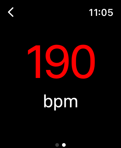
This project is about an Apple watchOS app which was created in order to prove the question whether a colour only display leads to a faster understanding of the body condition while running/working out. In order to prove it, a user study was made at the university.
In this project, I used SwiftUI/Swift and my own devices in order to develop the app.


Contribution
If you want to contribute or check out the project, you can visit the following link on my GitHub: https://github.com/Xovval/PulseLight
Results
The results of this user study can be found here: